Coolblue app.
An independent concept redesign of the Coolblue app, built as a working prototype you can click through instead of a video.
- Client
- Coolblue (concept, not commissioned)
- Year
- 2026
- Role
- UX, UI, prototype
- Scope
- Mobile app, 13 flows
- Stack
- HTML · CSS · JavaScript
01 / The problem
A shopping app lives or dies in the boring moments: finding the thing, paying for it, waiting for it.
This is a self-initiated concept, not made for or with Coolblue. The question was simple: how would the app feel if every flow kept the brand’s promise of a smile, from the first search to a refund?
So the scope was the whole journey, not a hero screen: search, product page, checkout, delivery tracking, store pickup, returns and refunds, thirteen flows in all.
02 / The system
The brand’s blue and orange, given rules.
Blue carries navigation and links, navy sets the big headlines, and orange is kept for the one action that moves you forward. Clean pill buttons, quiet cards on a light grey page, and a slab serif for the friendly asides. Brand names in the range are invented and every product image is drawn by hand.
Colour
- Blue#0090E3
- Navy#2A5CAD
- Orange#FF6501
- Page#F0F0F0
- Line#E3E3E3
- Text#0D1011
Type
- Display
- Nunito Sans
- Body
- Bitter
Corners
4–8 px, pills
03 / The build
A prototype that really runs.
The app runs live in a 390 × 844 phone frame next to the presentation, so you can jump straight to any flow and tap through it. Built in plain HTML, CSS and JavaScript, with no framework, so it loads instantly.
04 / Screens
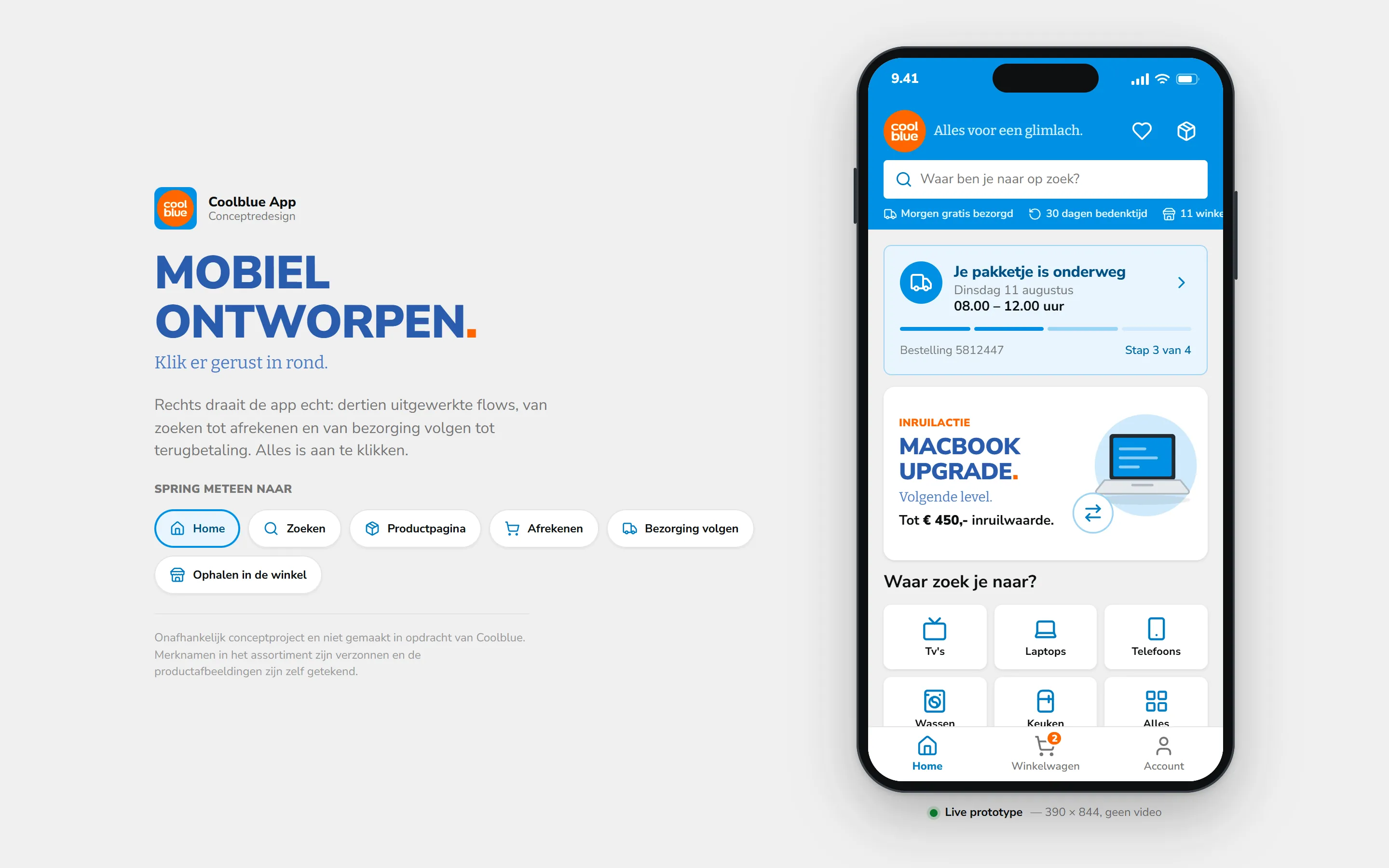
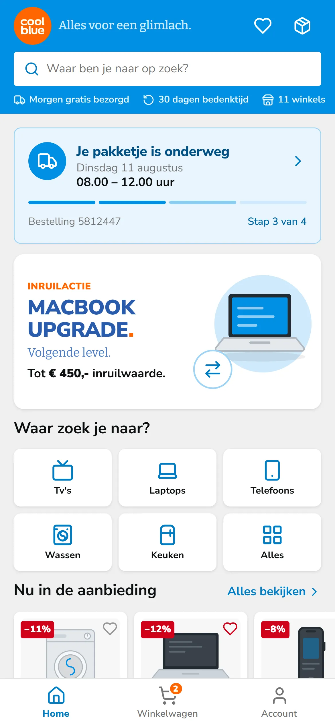
The presentation and the app home, desktop and phone.
05 / The result
What we would measure.
This is a concept project, so there are no client results. These are the numbers the redesign was designed to move.
- 01
Search to cart
Taps from the first search to an item in the basket.
- 02
Checkout completion
Share of started checkouts that end in an order.
- 03
Self-service
Deliveries and returns handled in the app, without a call.
Free · 30 minutes